Fashion Illustrations

Fashion Illustrations 
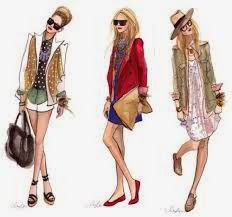
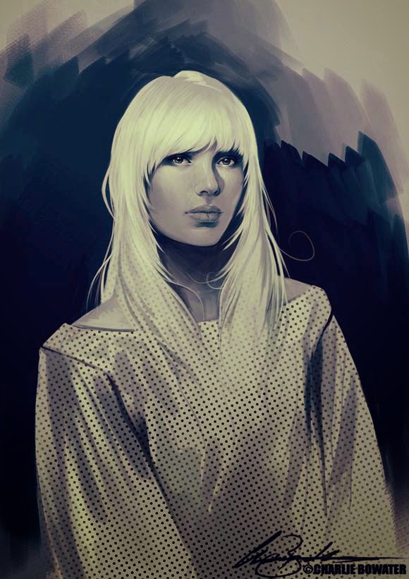
The key to great illustrations for fashion design lies in a good knowledge of the hu- man physique and the mastery of various drawing techniques.
The observation and study of the human body is vital to every fashion designer , the delicate curves and structures are the origin of all apparel and the perfect setting and surroundings to present them.
Traditionally illustrations were made with pencil, ink and watercolours. Today mark- ers and pens can do the trick as well and of course adobe Photoshop.
It all starts with Skeletons, If you understand how the human body is constructed the rest will be a walk in the park and you can illustrate all sorts of poses, stands and materials.
Fashion sketching class will be all about experimentation and refining your drawing abilities, your knowledge of basic figures and fashion stands will be put to a test. The grey pencil sketches will come live .


Skeletons

Skeletons 
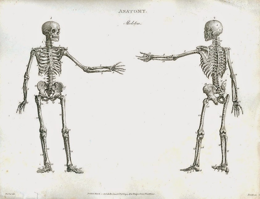
The human body is literally a big mass of water and protein hanging in and around a calcium frame.  This frame is the skeleton, made out of many different bones. These bones are the key to drawing the human figure, they are simple to move around and manipulate. We start every pose with a rough sketch of the skeleton, it will reduce the risk to draw to big for the paper and at the same time keep the overall figure in the right proportions before we start the more elaborate drawing of details and clothes etc..
The right page side shows how we construct a simple and rough sketch of the skeletal pose and then add body mass and ‘muscles’ to get the final pose --


Starting with the shoulder line then adding a spine and Hip bones at the same width, roughly sketched rip case and a neck + head. After that we can sketch arms and legs, the elbows are  is in the middle between hip and .


The female figure

The female figure
The classic stand is a figure with relaxed and loose hang- ing arms and straight legs, fully frontal. A fashion figu- rine is an over stretched idea of a normal figure, just like catwalk models are quite far from having a normal figure. Sometimes the human body proportions are split down and counted in ‘heads’ as the smallest unit. A nor- mal Person would be his or her head around 5 times in height where as a fashion fig- ure could be up to 8 or 9. If you closely study real fash- ion models on international catwalks, you will realise that they are not necessarily very tall or anything, but the have a very small head for a person of ca. 175 cm, which makes them appear taller. In this example shoulder width and hips have the same width If the shoulders are wider the figure will look more mascu- line, where as wider hips im- ply more femininity. Elbows and waist are on the same level. Wrists are roughly a bit lower than the crotch and the hands therefore even lower. For women the lower legs are generally longer than the up- per leg portion ( thighs)


The male figure

The male figure 
The construction of a male body varies only slightly from that of a female. The main characteristics are :
-Broader shoulders and smaller hips
-Almost absent waist
-Upper and lower leg almost same length.
The general appearance of a male body is sharper and more chiselled due too less body fat and more mus- cles. The 7 or 8 head idea remains and if we want to achieve a more masculine look we can play with the -V- shape of the body, meaning broader shoulders and smaller hips so it optically looks like the letter V. Also accen- tuating muscles will make it more masculine .


Legs are not just straight lines with feet attached, due to the in- tricate play of muscles and bones under the skin, we can make out a distinctive shape. Well sketched legs are a sign of so- phistication and can improve any fashion sketch . Legs should be long and slender with a sculptured knee and a faint idea of muscle, especially around the calf region in the lower part


The Face The soul of every Sketch

The Face The soul of every Sketch


The male face

The male face
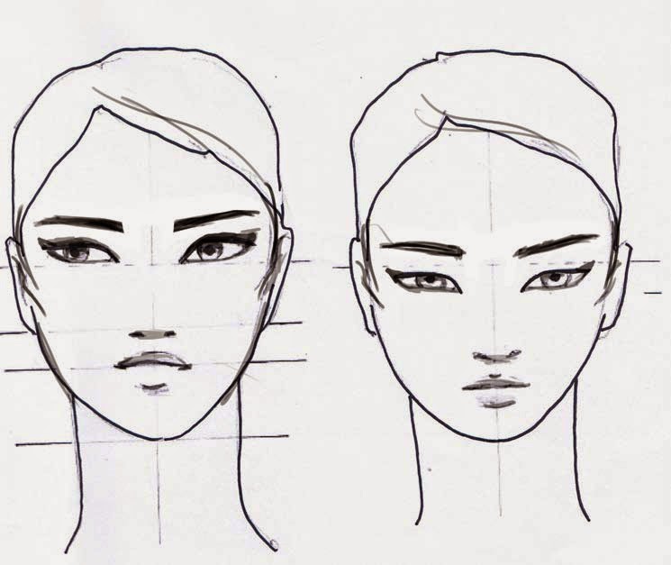
Faces can be easily constructed using a 50 percent rule. The eyes are exactly in the middle of the vertical the nose bridge in the middle of the horizontal guide of the face. The nostrils mark the middle of the lower half of the face and the mouth marks the middle of the lowest quarter of the face. The male face is generally speaking a rather square than round set up with an accentuated jaw- line and a wide chin. The eyebrows are low set and a visible Adam’s apple can be sketched to make the appearance even more masculine. Eyes and lips shouldn’t be too strong in order to avoid a make up effect.


The female face

The female face
The female face is loosely speaking a more oval shape, with smooth and round lines, giving a soft and aesthetic impression. Full lips and eyes with lashes make it feminine. The nose can be smaller and if the cheekbones are accentuated we can add some fierceness. The female eyebrows are usually a good bit higher up than the male eyebrows, this opens and enlarges the whole eye area, the 50% rules still apply. On the next pages though I will explain what happens if we slightly shift those proportions.


Eye positions

Eye positions
Depending on how the eyes are placed,  the overall feeling of the face can be altered. In general low set eyes give a cute and child like appearance where as high set eyes suggest matu- rity and adulthood. The base posi- tion is in the exact middle following the 50% rules


Normal eye position


high set eyes- adult face       low set eyes - baby face


Monday, 8 September 2014

Fashion Illustrations

Fashion Illustrations 
The key to great illustrations for fashion design lies in a good knowledge of the hu- man physique and the mastery of various drawing techniques.
The observation and study of the human body is vital to every fashion designer , the delicate curves and structures are the origin of all apparel and the perfect setting and surroundings to present them.
Traditionally illustrations were made with pencil, ink and watercolours. Today mark- ers and pens can do the trick as well and of course adobe Photoshop.
It all starts with Skeletons, If you understand how the human body is constructed the rest will be a walk in the park and you can illustrate all sorts of poses, stands and materials.
Fashion sketching class will be all about experimentation and refining your drawing abilities, your knowledge of basic figures and fashion stands will be put to a test. The grey pencil sketches will come live .


Skeletons

Skeletons 
The human body is literally a big mass of water and protein hanging in and around a calcium frame.  This frame is the skeleton, made out of many different bones. These bones are the key to drawing the human figure, they are simple to move around and manipulate. We start every pose with a rough sketch of the skeleton, it will reduce the risk to draw to big for the paper and at the same time keep the overall figure in the right proportions before we start the more elaborate drawing of details and clothes etc..
The right page side shows how we construct a simple and rough sketch of the skeletal pose and then add body mass and ‘muscles’ to get the final pose --


Starting with the shoulder line then adding a spine and Hip bones at the same width, roughly sketched rip case and a neck + head. After that we can sketch arms and legs, the elbows are  is in the middle between hip and .


The female figure

The female figure
The classic stand is a figure with relaxed and loose hang- ing arms and straight legs, fully frontal. A fashion figu- rine is an over stretched idea of a normal figure, just like catwalk models are quite far from having a normal figure. Sometimes the human body proportions are split down and counted in ‘heads’ as the smallest unit. A nor- mal Person would be his or her head around 5 times in height where as a fashion fig- ure could be up to 8 or 9. If you closely study real fash- ion models on international catwalks, you will realise that they are not necessarily very tall or anything, but the have a very small head for a person of ca. 175 cm, which makes them appear taller. In this example shoulder width and hips have the same width If the shoulders are wider the figure will look more mascu- line, where as wider hips im- ply more femininity. Elbows and waist are on the same level. Wrists are roughly a bit lower than the crotch and the hands therefore even lower. For women the lower legs are generally longer than the up- per leg portion ( thighs)


The male figure

The male figure 
The construction of a male body varies only slightly from that of a female. The main characteristics are :
-Broader shoulders and smaller hips
-Almost absent waist
-Upper and lower leg almost same length.
The general appearance of a male body is sharper and more chiselled due too less body fat and more mus- cles. The 7 or 8 head idea remains and if we want to achieve a more masculine look we can play with the -V- shape of the body, meaning broader shoulders and smaller hips so it optically looks like the letter V. Also accen- tuating muscles will make it more masculine .


Legs are not just straight lines with feet attached, due to the in- tricate play of muscles and bones under the skin, we can make out a distinctive shape. Well sketched legs are a sign of so- phistication and can improve any fashion sketch . Legs should be long and slender with a sculptured knee and a faint idea of muscle, especially around the calf region in the lower part


The Face The soul of every Sketch

The Face The soul of every Sketch


The male face

The male face
Faces can be easily constructed using a 50 percent rule. The eyes are exactly in the middle of the vertical the nose bridge in the middle of the horizontal guide of the face. The nostrils mark the middle of the lower half of the face and the mouth marks the middle of the lowest quarter of the face. The male face is generally speaking a rather square than round set up with an accentuated jaw- line and a wide chin. The eyebrows are low set and a visible Adam’s apple can be sketched to make the appearance even more masculine. Eyes and lips shouldn’t be too strong in order to avoid a make up effect.


The female face

The female face
The female face is loosely speaking a more oval shape, with smooth and round lines, giving a soft and aesthetic impression. Full lips and eyes with lashes make it feminine. The nose can be smaller and if the cheekbones are accentuated we can add some fierceness. The female eyebrows are usually a good bit higher up than the male eyebrows, this opens and enlarges the whole eye area, the 50% rules still apply. On the next pages though I will explain what happens if we slightly shift those proportions.


Eye positions

Eye positions
Depending on how the eyes are placed,  the overall feeling of the face can be altered. In general low set eyes give a cute and child like appearance where as high set eyes suggest matu- rity and adulthood. The base posi- tion is in the exact middle following the 50% rules


Normal eye position


high set eyes- adult face       low set eyes - baby face